|
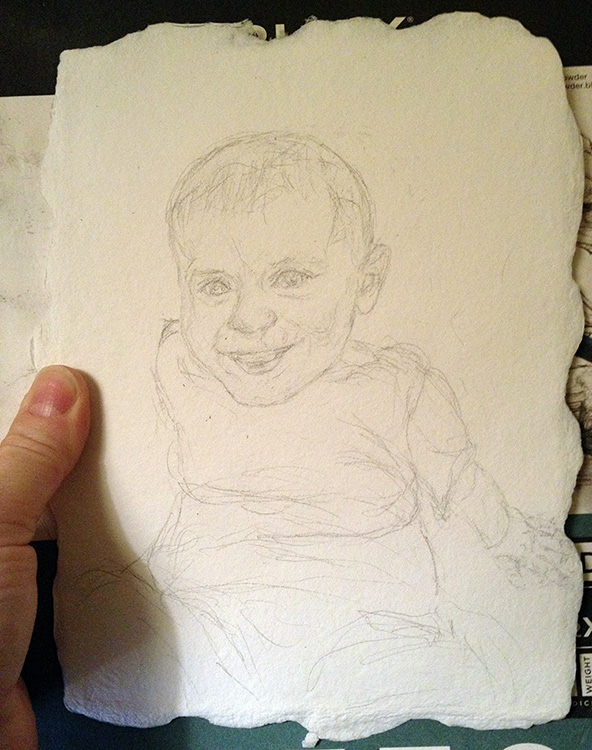
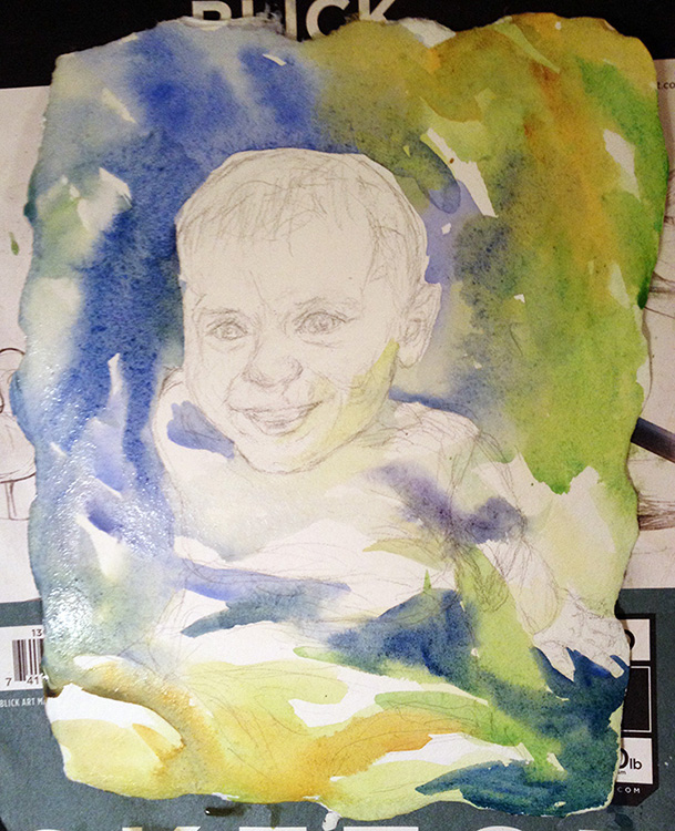
Painting Demonstration 1 Always start with a very lightly drawn but very detailed sketch. Don't just draw the features but draw the shapes of the highlights and shadows. Features are not as important as the blocks of value in a portrait. They all need to be in the right place though! |
 |
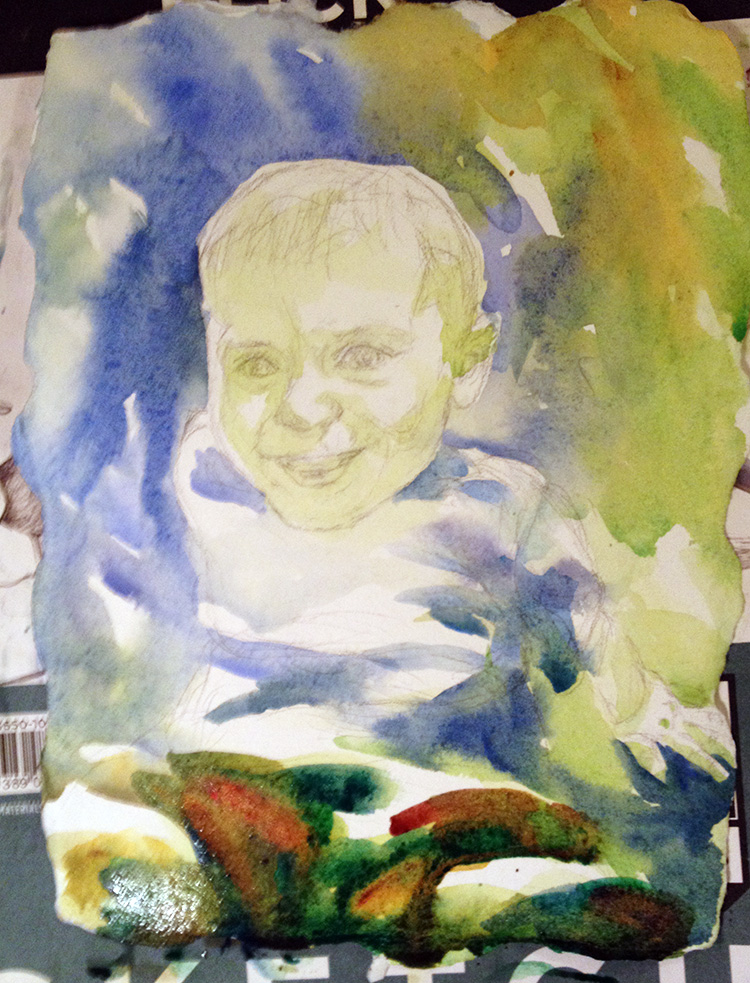
Painting Demonstration 2 I usually start portraits with a pale wash of a greenish yellow. I want to paint the background very dark so I start painting that immediately. I use negative painting around the face and hands, pulling background color into the shadows. |
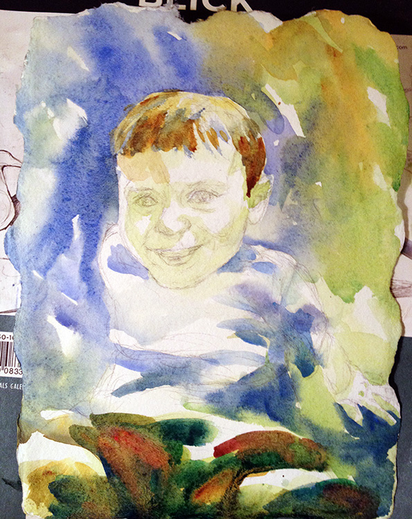
| Painting Demonstration 3 A little more shadows pulled into the face. His head is starting to round with just this light modeling. I want to be very careful I don't paint too much on the face but keep it light and spontaneous. Pthalocyanine green and quinacridone gold start the pants. I'm painting them very loosely, letting the color flow. Artist's Tips Paint around the face, not much into the face for a child's portrait. That way, you don't paint it too dark! |
A good watercolor portrait takes half the brushstrokes of the sketches before it!
Jennifer Branch |
Painting Demonstration 4 I start the hair with cobalt blue and quinacridone gold. I paint the hair in chunks, not individual hairs. More detail in the hair would look forced and distracting. Think of each section of hair as a shape you're modeling. |
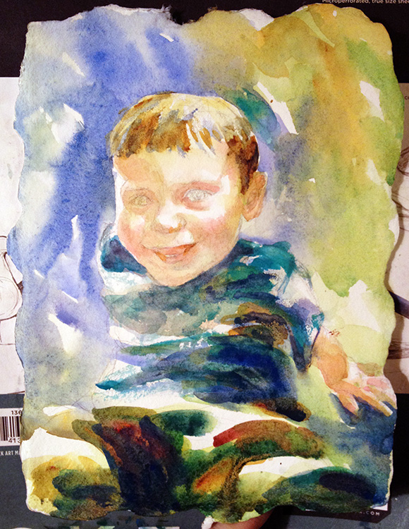 |
Painting Demonstration 5 Some nice bold darks for his shirt, ultramarine blue and pthalo green, blur into his pants. I leave highlights to show the folds of fabric. I lightly shape the shadows of the face with quinacridone gold and quinacridone red. I leave everything a bit blurred and light, not wanting many shadows or harsh edges in a small child's face. Cheeks and a few other areas get a tiny dab of red to give them a rosy glow. And this is the point my model walked off. Not bad attention for a 2 year old! I finish up the sketch the next day in my studio with the help of the photo I took at the start. |
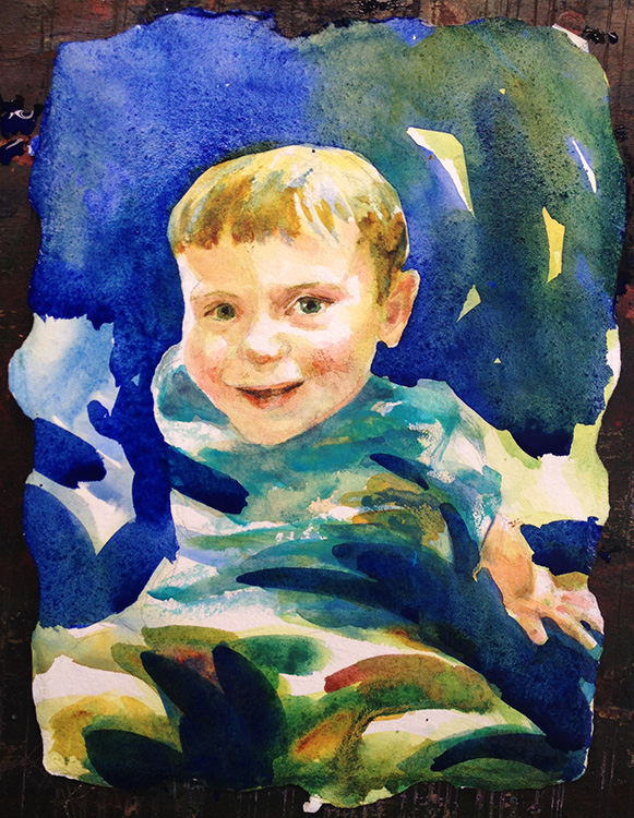
| Painting Demonstration 6 The background was way too light so I attacked it with ultramarine blue! I pulled lots of color into the background and all the deep shadows. The portrait was just pale and insipid before! I let myself add a few details with a rigger. I let the painting dry completely so I don't smear that strong color everywhere!
|
|
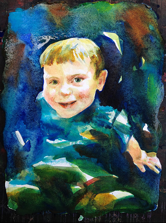
Painting Demonstration 7 I liked the darker so I painted even more darks! The dark really makes the face of the portrait glow in comparison. I pulled color into the shadows, floated cobalt teal on the surface and generally just played with it! |
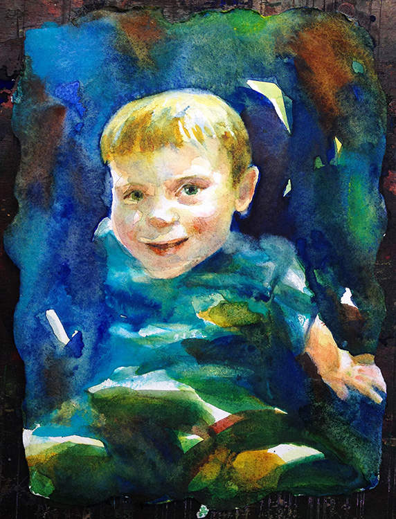
I refine a few edges and add just some touches of detail to the face. I blur the hands and a few edges. That's all there is to it! Very simple, happy portrait. Uncomplicated, like a 2 year old!
I like this portrait of my little boy. It's happy and gleeful, just like him. I'm probably going to paint a final portrait when I get a chance. The sketch is really cute but I'd like to do it again with fewer brushstrokes and less fussing!
I like the sense of barely paused action. That's my boy!
Happy Painting!


