
How to Plan a Painting, a Venice Cathedral
2015-03-05
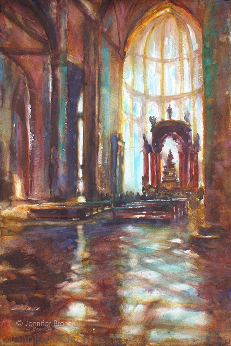
San Giovanni e Paolo, Venice, Italy
First, a little bit about this particular church. The church of San Giovanni e Paolo, Venice's largest Dominican church, sits on its own square, the campo Giovanni e Paolo. I spent a lot of time on this square. There's a lovely cafe right on the edge of a canal. The facade of the church is not the interesting part of the square. It's a rather boring brick Gothic style cathedral. The most beautiful building facade belongs to the hospital building, the Scuola Grande di San Marco. But once you walk into the church of San Giovanni e Paolo, the interior captivates you. It's huge with many beautiful side chapels. The ancient pink and cream marble of the floor is worn in the center from the many people who have traveled to the altar. It's dark and medieval but the light behind the altar draws you down into the church.
As you know, I love painting ancient floors! Light behind the altar in a church seems so pure and holy to me. The day I decided to paint this church, the light was absolutely perfect. I took about a million photos and did some very rough sketches. I also took the time to walk around and absorb the atmosphere of the church. That way, when almost a decade later I decided it was time to paint, I have my notes, my photos and when I look at them I'm transported back to that moment in the cool, dark church with the light streaming down the sanctuary.
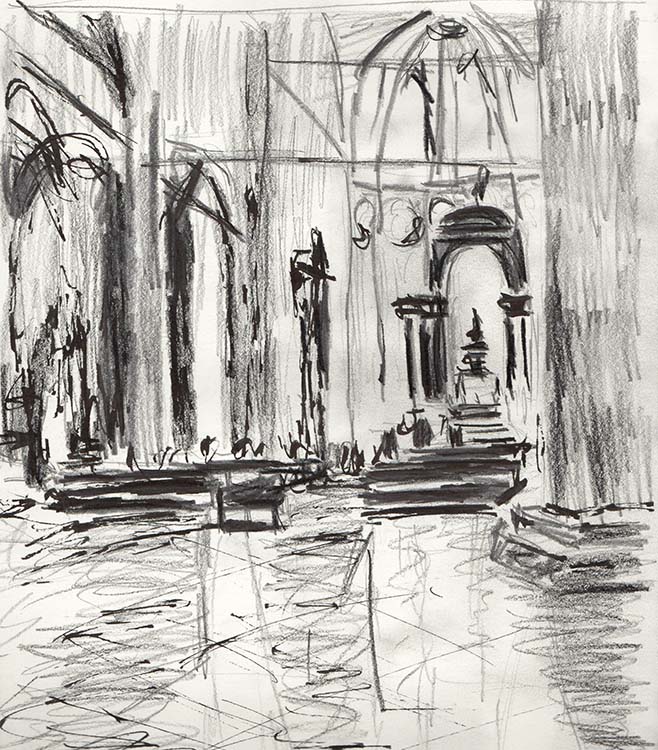
I start, as I always start, with a value study. This is a bit squarer than the painting ended up being, but that's part of the decisions being made. Is this a better vertical or horizontal? What's the focus of the painting? What's distracting about the sketch? Where does my eye travel in this painting?
This is a little bit tricky (part of the reason it took me so long to start painting!) because the line of light provides a path into the painting and then drops the viewer right back out. The other light to the left is stunning, so how could I leave it out? But it's also very distracting, both the golden glow and the bright white of the chapel window.
And where do I want my focus? Is it the altar? Or the windows beyond? All decisions that need to be made.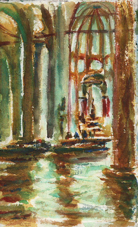
So then I sketch in my sketchbook. I've decided on a cool clear blue light drawing the viewer in. Cool light surrounded by dark warm colors is a bit tricky to do. In this sketch, it's clearly too green. I also have too much detail and sharp edges at the center of interest. I think of God as more of a blur of light. Sharply delineated edges just doesn't work for that. The second window and that wonderful light is too distracting. I knew it would be, but it's just so beautiful that I hate to leave it out - one of the biggest killers of good compositions!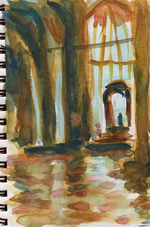
Okay, so here the blue is cooler, but the edges are still too defined. The blue is also not light and ethereal enough.
By the way, can you tell the difference paper makes? The first value study was on throwaway drawing paper, the second in my Indian handmade paper journal, the third on Strathmore machine made Visual Journal. Quite a difference! The final painting is on Twinrocker handmade paper, which is lovely to work on. However, good paper doesn't save a bad composition, so let's keep on.
I've toned down the left window too much. It's rather dull now. The altar is still the center of interest, but I want to raise that a bit. Thinking along the lines of the church is a filter God is seen through, as well as a path to God. How can I make this painting show that feeling?
More light and brightness. In the church, the darkness of the entry was almost painful coming in from the hot sun. Then the bright light dazzled so that I almost couldn't see where to go. So much value contrast.
So I need to raise the focus up, add the dazzling light, add a bit more contrast to the left window. I also need to fix the problem of the viewer dropping out of the painting where the light gives a path to go down. Hmmm, I think I'm ready to tackle the real one! After all, it's just paper and paint!
Venice Cathedral, 16" x 20", watercolor on paper
And I got it! It's always touch and go whether there's going to be yet another one but this one worked! Warm darks surround cool lights. The blurs and sparkles of light lifting you toward God's light. Warm, human candle light glowing on the left. A warmer, but still light from the side chapel window. A crowd of blurred people standing before the altar.
I have to tell you, it was hard leaving the detail out of the gorgeous windows. But as I knew from my sketches, detail would pull the whole thing right back down to earth. My only consolation is that I have sketches and photos of the windows and I can just paint another painting showcasing their pink marble and glowing light!
The red columns of the altar are a wonderful contrast against the cool light. I'm particularly pleased with the blue warm reflections on the columns in walls guiding the viewer down the path. I also love the warm light at the top of the nave as if it's lit by fire.
All in all, I consider this one of my most successful paintings so far! I'm not entirely sure whether I'm keeping it on the market very long because I really hate selling some works!
I hope you've been interested in the process of planning a painting. If you have any questions about the painting planning please ask!