Painting Demonstration 1
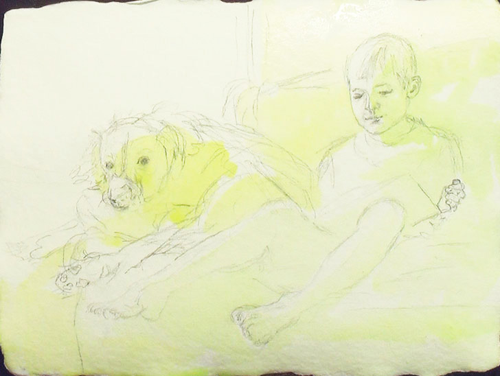
Pencil lines should always be very light when painting a watercolor portrait. You want the drawing to be accurate but you don't want every tiny detail in it. You're looking for big shapes and areas of strong highlights or colors that you want to mark.
I start most portraits with a wash in only the shadows of azo yellow with a tinge of pthalocyanine green. This lets me know the shadows quickly when I'm painting. It also gives a lovely glow to shadow areas. Knowing your underpainting and how it affects your later washes is key to watercolor painting!
Keep this initial wash very light and also, if you're uncertain about a shadow, don't paint it! It's far easier to add shadow later rather than take paint away!
Painting Demonstration 2
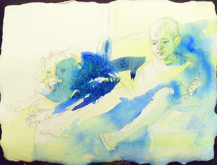
Next I'm doing the exact same thing but over less area than I painted before and with ultramarine blue. I'm simply blocking out where my strong shadows will be. It looks very dark now, but remember that watercolor paint dries much lighter than when you first put that luscious rich color on! If you're worried about the paint being a little dark, it's probably still a little light! Remember, paint in thin washes, don't gob it on! Texture is for oil paints!
Painting Demonstration 3
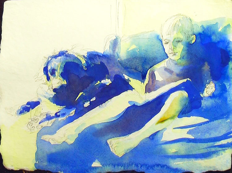
A bit more ultramarine blue in the deep shadows. I also use a bit of maroon perylene to make the ultramarine blue recede. I'm still using just the single round #14 brush for the painting.
The gray shirt is mostly ultramarine blue with a touch of maroon perylene. This dulls the bright blue just enough. I still want the shirt to flow into the blue background since it's not an important part of the portrait. Always connect everything!
Negative painting is perfect for a light subject against a dark background like this. I don't want to get too heavy on the pale skin (especially on any child's portrait, no matter what the skin color). By doing most of the portrait by negative painting the background, I don't have to paint as much on the actual face and hands. This way, it doesn't get too heavy.
Artist Tips
If in doubt, don't paint it!
Painting Demonstration 4
"A portrait is a picture in which there is just a tiny little something not quite right about the mouth."
John Singer SargentIt's starting to get fun now! I've done the background work and I get to paint the portrait!
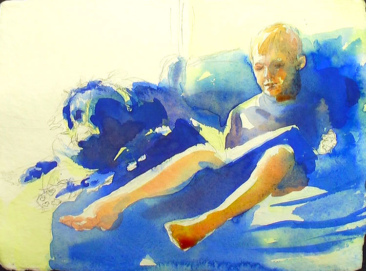
I start with a pale wash of quinacridone gold and quinacridone red. This is a combination I use a lot in portraits. There just aren't many colors that are good for pale skin and glowing washes.
Even in this layer, just start by painting over the pale green wash. I don't want to lose the white highlights. They're critical!
Painting Demonstration 5
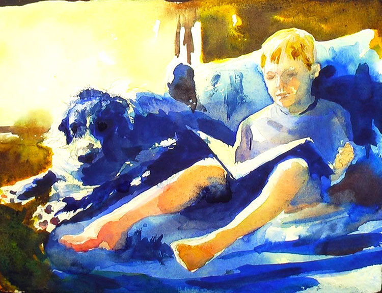
So how much difference does the dark background make? You can really see how negative painting makes portraits!
So in the video, I go on about how cute painting dog's paws and little boy's toes are. I stand by that!
Part of the fun is they are so tricky to do. You have to get it right with just a few strokes of the brush, overworking is going to flub it. Plus, they are really cute!
My living room is surrounded in windows, so it's painted a cool milk chocolate color. I love the cool dark in summer when it's boiling outside here in the South!
I didn't show the background painting much in the video since I tried to leave in as much of the face as possible. To paint the brown, I did a wash of quinacridone gold, flooded in some burnt sienna and a few touches of ultramarine blue to connect it to the other blues. The bright window is just pale dashes of yellow.
I left the option open to add greens or darken the window a bit if it was distracting or didn't show my dog's white fur enough. The suggestion was all I needed though. And while the window is distracting, for a sketch on a sunny afternoon, it was perfect!
Painting Demonstration 6
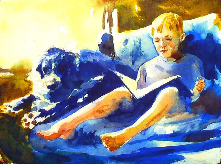
I'm mostly painting the face in this layer. All those little touches that it's hard to stop from getting fussy!
Since I've already painted the structure of the face, it's time to start adding the darker definitions. I always paint eyebrows and eyelashes with little dabs, hit and miss. If you paint solid lines that don't blur, it just doesn't look right. It looks like clown makeup!
I use more of the quinacridone gold and red I used earlier, adding touches of ultramarine blue to darken and shadow it. Keep your palette very simple, even if you decide to paint the skin bright green! If it's not fairly monochrome, it's not going to look right!
The mouth needs to be done with just a few lines in a portrait. The mouth is the easiest thing to overwork. Slightly more red, slight definition. Don't paint the full lip line or every tooth!
When I paint the legs and paws I just do a few quick dashes, leaving the lines. Keep it simple!
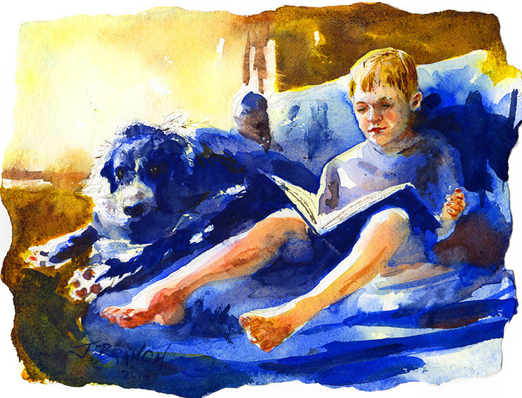
Final Watercolor Sketch!
If I'm honest, if I painted it two more times, it would be excellent, not just a good portrait sketch. The more times I paint a portrait, the better it gets. Each painting uses fewer strokes, regains more spontaneity. By the time I've painted three portraits, I know my subject and the light like the back of my hand and it needs just a bit to convey the portrait.
But I don't need for everything I paint to be a perfect finished work. Sometimes I just want a lovely memory to hang on the wall - and move on to the next painting!

Related Art Lessons


