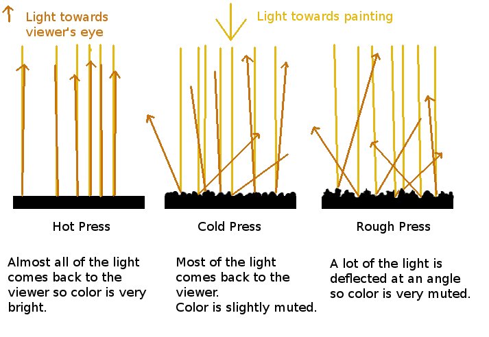
There are three basic watercolor paper textures. The watercolor paper surface you choose transforms your painting.
Cold Press Watercolor Paper (NOT)
Paper Finish
Cold press paper is finished with a slight texture to the watercolor paper. The texture is made by just the felts pressing the layers of paper as it dries.
Description
Cold press paper is a good all around choice, perfect for beginners. I highly recommend learning to paint your first 20 paintings on cold press paper.
Positives
You have the most control over your brush and paint flow on cold press paper. It's the perfect balance between color and texture.
There's a reason most artists use cold press the most!
Negatives
Cold press paper is a basic choice. Nothing wrong with cold press paper, but nothing dramatic because of your paper either.
You're not going to get extreme brightness or interesting texture as easily as another finish. It's going to be the easiest paper to paint on, with a good balance of color and texture.
Sometimes basic is exactly what the painting needs!
Cold Press Paper Example

Sky Watercolor Painting tutorial on Arches 140# Cold Press
Rough Press Watercolor Paper
Paper Finish
Rough press paper is finished with a very pronounced texture. The watercolor paper texture is made by rougher felts between the drying sheets of paper.
Description
Rough press paper makes for terrific textures with hit and miss washes.
Positives
Rough press paper is for dramatic values, not dramatic colors. You can get some great sparkles by just barely glding your brush over white paper. You can get exciting textures for craggy rocks or leafy trees by layering watercolor washes. Lots of possibilities!
Negatives
Rough press gets muddy quickly - because it dims colors. This makes it very difficult for beginners to get colors they like.
The color dimming can be pretty dramatic. Some of the blues, like pthalo blue, will dull to yucky grays if used without mixing another
color that floats them a bit.
Rough Press Paper Example
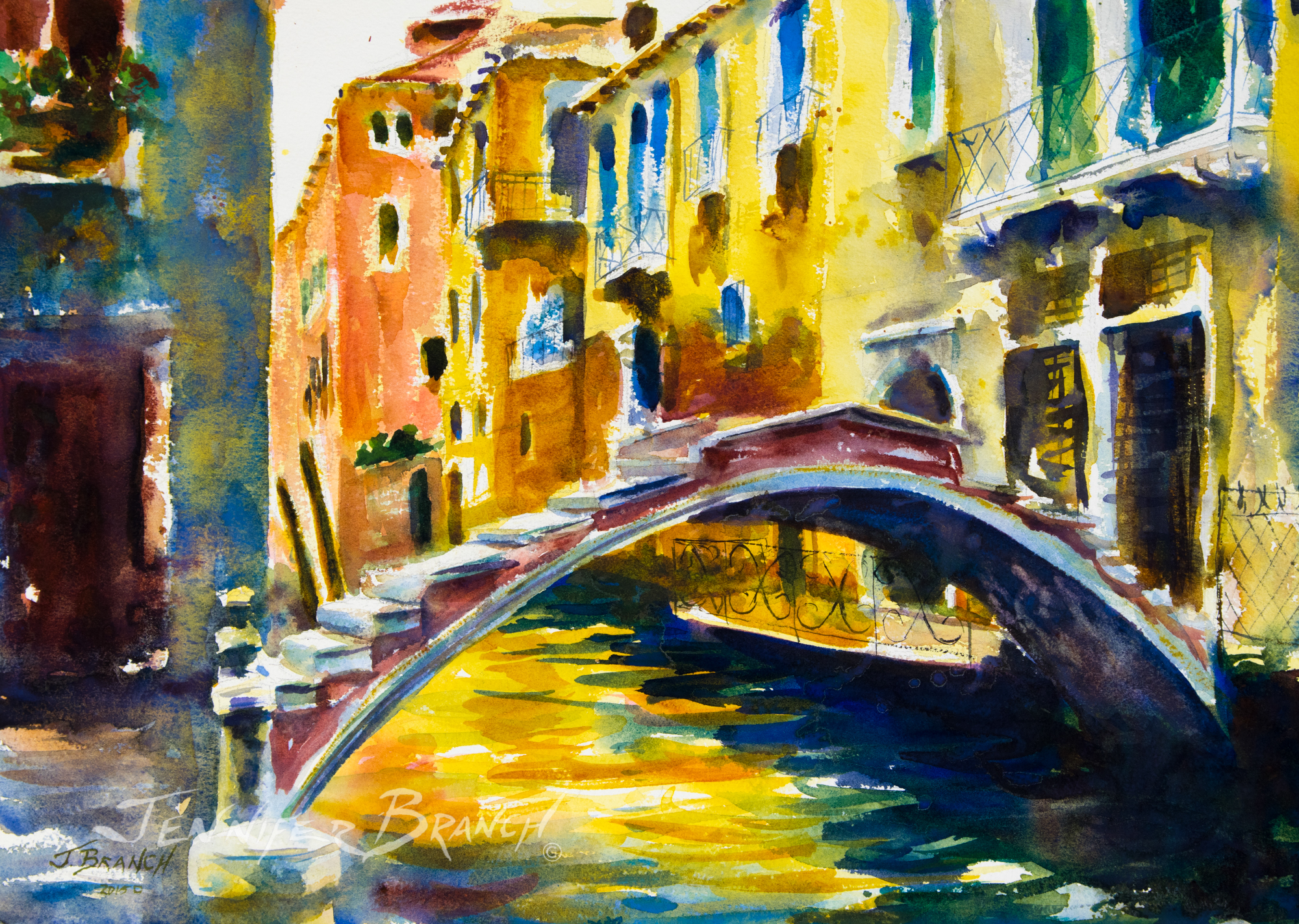
Venice Bridge Watercolor Painting tutorial painted on Arches 140# Rough Press Paper.
Hot Press Watercolor Paper
Paper Finish
Hot Press Paper has a slick, smooth surface. Pigments rest on the surface.
It requires a very different technique than cold press or rough press paper. You push pigments around on the surface, they don't sink into the paper.
Description
Hot press paper is very smoothly finished by rollers pressing it completely flat. It's basically ironed!
Positives
Hot press paper intensifies colors. Everything looks brighter on a smooth surface since all the light bounces right back in your eyes. You get almost the wet pigment color, versus a dulled version on a rougher paper.
Negatives
No texture makes good dry brush difficult on hot press paper. You can get texture, but it's difficult not to get fussy with it.
Texture doesn't flow like rough press paper since the surface is smooth and the paint flows smoothly.
Lack of surface texture means few texture effects. White watercolor paper sparkle has to be done in patches instead of textured sweeps.
Hot Press Paper Example
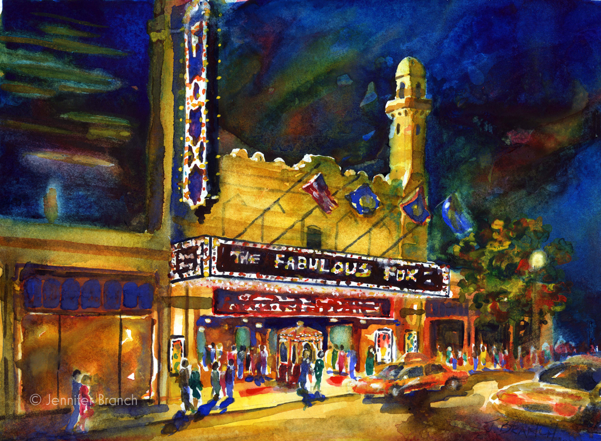
Fox Theater, Atlanta, Georgia watercolor painting on Arches 140# Hot Press
Does the texture inspire you? Or the vibrant color?
Do you have trouble seeing the subject's color dulled with rough finish paper or a smooth, even texture with hot press paper?
Don't forget that often, paper surface varies more from company to company than cold to hot press textures. One company's cold press can be a slickly smooth surface - another's can be a rough texture. Try a lot of different papers and decide which you like painting on. Never stick with just one watercolor paper texture. Sometimes changing your favorite finish can get you out of a painting rut!
Always be guided by the watercolor painting you're painting rather than a texture you liked on another painting. Different textures work on different paintings. I might paint an ocean surf crashing on rocks on rough press paper if I'm inspired by the sparkle on the waves and sheen of the rocks. The same scene would look completely different on hot press paper if I want to emphasize the blues of the water and the rich darks of the rocks.
A Venice scene on rough press paper might show light sparkling on the water and the amazing stucco textures with cracks and layers. Or on hot press paper, I'd emphasize that Italian light in ripples on the bright reflections in the water and the brightly colored stucco. Totally different paintings changed by the paper texture.
Quite often, I pick cold press as a happy medium between extremes. My favorite paper by far is handmade Twinrocker paper. It combines wonderful texture with brighter colors than most cold press papers. However, there's very little variation between their cold, rough and hot press papers. I just order cold press!
I hope this article guides you to choose the paper that best expresses your subject how you see it.
Happy Painting!
Sign up for my email list!